We’re onto the fifth P of marketing: packaging. For a book, this of course means the cover. In a previous blog on pricing, my sales forecast made it clear that the costs of a professional cover designer would not be recouped. So, it’s up to me.
The important points to remember with my cover design are:
- What works in a bookshop doesn’t necessarily work online, and I have to design with Amazon in mind
- The cover that comes up on someone’s screen when browsing Amazon might be tiny
- If the potential reader is on their Kindle, the photo will be black and white
- My name is not important because few people have heard of me, and this is my first novel
- The style I choose will give some indication of genre
When I worked in music publishing, we distributed a self-published book of songs for children by a very popular composer of music for junior schools. The songs were suitable for older junior school children, but the cover art was the composer’s pre-schooler daughter’s work, giving the impression that the content was aimed at very young children. Teachers of older children would ignore it, while teachers of younger children would open it up only to find it was unsuitable for their needs. This shows how important the cover of a book is to convey its content.
Here are some examples of other authors’ covers:

It’s clearly going to be a romcom. This cover also stands out from the other books in a similar genre. It would probably have more appeal to women than men (it’s rather pink), but avoids the teeny-skinny-people-cartoon-and-curly-writing cliché that is the badge of chicklit. I’ve just started reading this: it’s very, very funny, though explicit. The cover has a hint of saucy British postcard about it, and that’s perhaps a clue to what’s inside.

This screams chicklit: pink, girly silhouette. It’s a fabulous book, tackling serious issues in the context of a love story, and it’s both funny and very sad. The cover, to me, makes it look more frivolous than it is. Online, it doesn’t work well: there’s not enough contrast between some of the text and the background, so when I went on Amazon, all I could read was ‘Before’ and the author’s name. My Dad loved it too and thought it was extremely well-written, but he read it because I mentioned it in an earlier blog. I doubt the cover would have caught his attention.

Almost perfect for the web, although some of the text is too small (‘Twenty years, two people’ in particular). This has strong images and has been mentioned by quite a few commentators for its step away from traditional design. I bought this in bookshop quite soon after it was published, having not heard of it. The cover attracted me to the book, and inside the concept and opening scene (University in the 80s, which I caught the back end of) hooked me in. Online, the cover would have grabbed my attention and the sample would have led to me buying the book.

Well, it’s chicklit, I presume. It has a cartoon girl on the front and lots of pink. But I can’t read the title. This is a HarperCollins book – a publisher who can surely afford a decent graphic designer.

Again, a cover marred by illegible text, and it doesn’t appear to be available other than as a download, so the cover needs to be particularly web-friendly. All that catches my eye is the huge bunch of roses. To me, that indicates Englishness, a female protagonist and there’s something melancholic abut the photo, suggesting tragedy. It actually states on the cover that it’s a love story, set in the US, but I couldn’t read that until I went into the product details on Amazon. The tiny writing at the bottom is in an illegible curly font – it’s actually quoting a review, and covers will normally use a very clear font for quotes.
So there are some examples of what works for me and what doesn’t. Translating that into my own cover is a little more challenging; I can see what’s good and not so good in other peoples’ designs, but pulling something together that attracts the kind of readers who would enjoy my book has proved difficult.
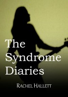
I wanted to produce something early on to go on my website and started off with this:

The main problem is the title font. It’s not clear. I wanted it to have a hand-written feel and tried to make it clearer by highlighting it, but it just looks messy. I’m not entirely sure about the photo. I suspect the story has more appeal to women than men; that’s what one of the writers’ groups I took it to thought too. In the other writers’ group, the men seem to be getting into it perhaps more than the women. I’m not sure how much appeal the cover has to women. My husband says he’d pick the book up because as a hot-blooded male he’d be drawn towards an image of the female form, but inside it’s not really his kind of thing (which would be Tom Clancy).
The story hinges around a successful female rock musician (Syndrome is the name of her band) who’s written some diaries, and the cover depicts her. There are some quite dark themes in the book, although there’s also a romance central to the story. It’s written in the style of mainstream fiction – not frivolous, but not heavy-going either. I wanted a female image with a guitar; it’s actually a bass. I found the original image on clipart, and cropped it quite a lot (partly to get rid of the four tuning pegs as a regular guitar would have six). So with a cover budget of zero, there is some compromise!
I’ve subsequently redone the cover, with clearer text.

I’m not entirely convinced by the red, as it looks a bit ‘thriller,’ but having tried different colours, this is what stands out without going monochrome (although I think my name might work better in black and white, as in the previous version). The ‘Kindle image’ is below, and small: the text isn’t as clear as I’d like.

There’s still some time to play with the cover. The best-I-can-make-it version will shortly be going to my beta readers, freeing me up to work on other aspects of the book.
- What covers have you seen that you thought were particularly good (or bad!)?
- How would you improve my cover?
This is the 6th blog in a series on marketing.
 Once The Syndrome Diaries was uploaded to Amazon, it was live within hours. There was a huge temptation to carry on fine-tuning the content and to hold back on publicity: one of the hardest things about publishing is letting go of your baby, knowing that it could still be better. Everything can be better, but there’s a danger of editing and editing and never letting the novel leave home. So I emailed, tweeted and facebooked.